Last updated on June 23rd, 2026 at 01:41 pm
The average website user conversion rate is about 2.35%. Having a great web design can dramatically increase your conversion rate, and therefore your bottom line. In this blog post, we will discuss 10 straightforward and effective ways to improve your web design. Whether you’re starting from scratch or looking to make some updates, these tips will help you create a visually appealing and user-friendly website that drives traffic and boosts conversions.
1. Add Social Proof
One of the easiest ways to improve your website’s conversion rate is to add social proof. Social proof is the concept of adding reviews or content that showcases other people like your product or service. Social proof helps establish trust early on with new visitors as they can easily see you have experience and other people liked your product/service.
Here are some examples of implementing social proof:
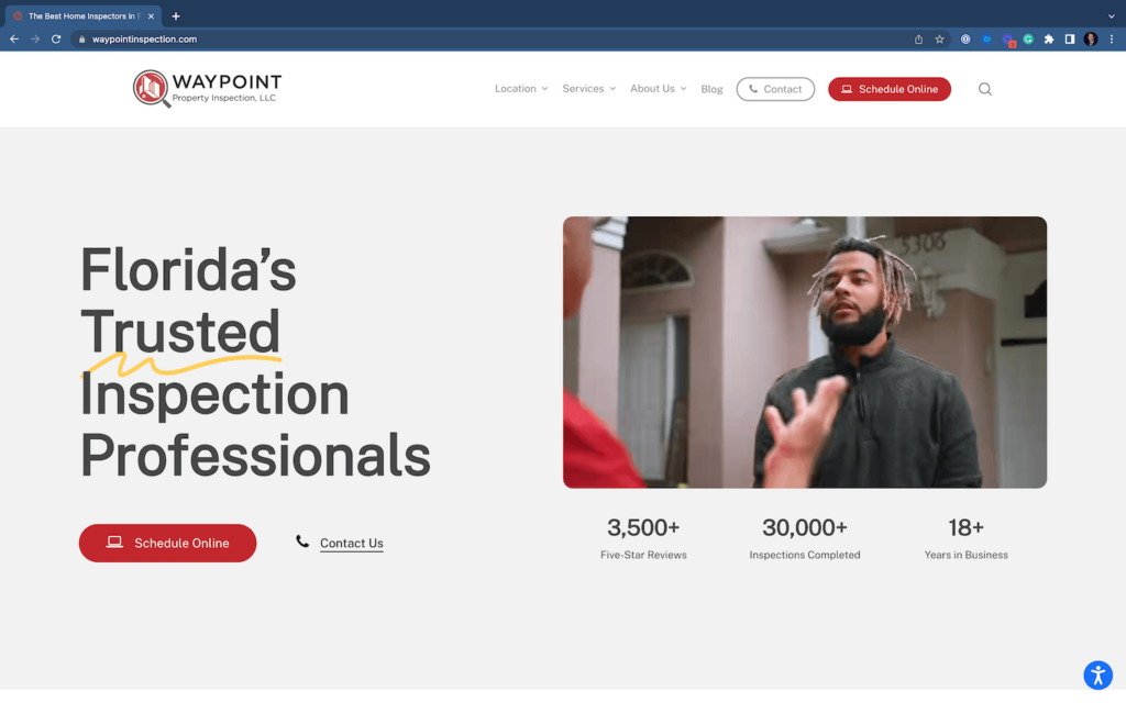
In this example, Waypoint Inspection uses statistics or numbers at the very top of its website to showcase its reviews, inspection counts, and the number of years in business.
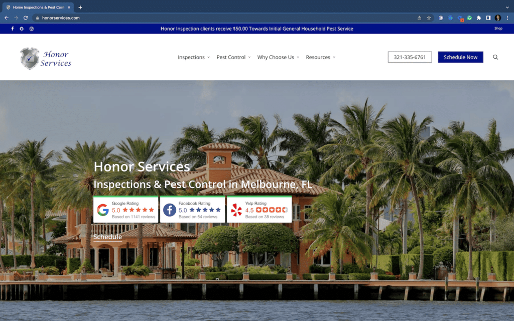
Honor Services uses badges that showcase their overall rating on different social platforms like Google, Facebook, & Yelp.
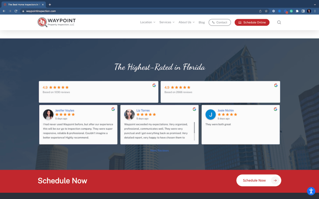
Finally, this brand also uses testimonials at the bottom of its webpage near the call to action.
As you can see, adding social proof is a super easy way to quickly establish trust and help consumers feel more confident in clicking on your call to action. Next, let’s talk about your call to action.
2. Add Call-to-Actions & Keep It Consistent
Call to action are buttons or areas on your website that show the consumer has an intention/interest in your product or service. For service-based businesses, it’s generally through a quote, schedule, or contact button. For product-based businesses, it’s generally purchase, buy, or add to cart.
Your call to action on your website should be frequent and consistent. Try using the same colors and terminology. In addition, add a call to action where it makes sense. In most cases, that is going to be on the top right of your website in the navigation bar, as well, as at the bottom of the site just before the footer.
Then, you can add more calls to action throughout the design as the user scrolls. Just be careful not to overdo it 😉.
Check out these examples from Greenworks Inspections which uses frequent calls to action that align with their branding/colors.
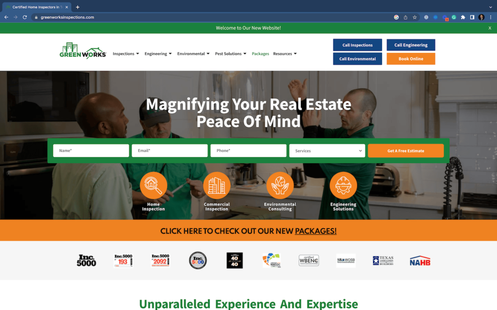
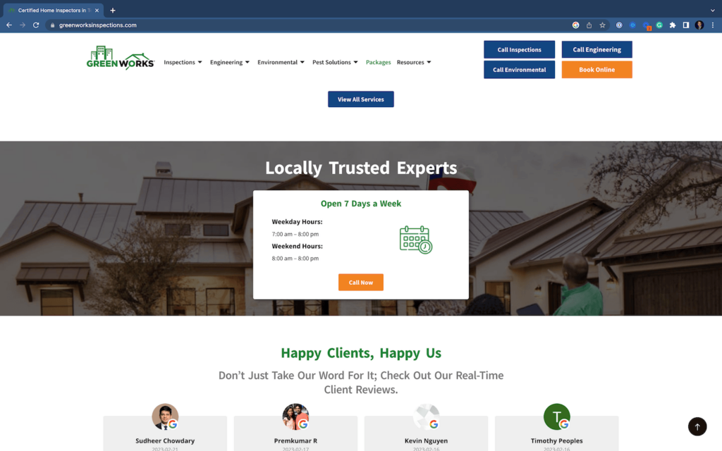
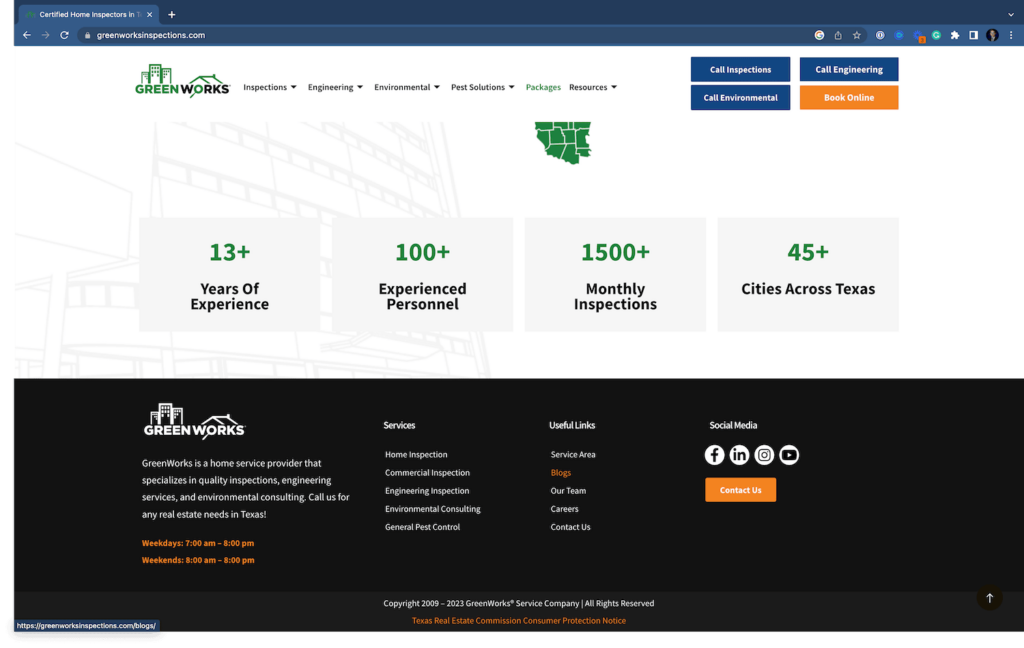
As you can see from the screenshots, they use calls to action at the top, the main navigation, in the middle of their home page, and the footer. All of each stay consistent with their branding and messaging.
3. Use a Consistent Color Scheme & Brand Kit
As you have noticed, we kind of already mentioned using a consistent color scheme in the call to action. It is also important to use a consistent color scheme and brand kit throughout the entire web design.
A brand kit includes your font family, logos, and color scheme. It’s practically your rulebook for how your brand is portrayed and shown in print and online.
Without a consistent brand, your web design can look cluttered and mismatched. Overall, it just does not look professional.
4. Use a Simple Navigation
Next, we have using a simple navigation. Your navigation refers to the top bar with links to different pages.
For service-based businesses, it generally follows a navigation bar with the following: services, about, resources, and then your call to action. For product-based businesses, it might be a little different depending on if you are an online store or not.
Additionally, a well-designed navigation menu makes it easy for visitors to find what they’re looking for quickly. Organize your website’s content logically and create a user-friendly menu that is intuitive and easy to navigate. Incorporate dropdown menus, breadcrumbs, and internal linking to enhance user experience and keep visitors engaged.
To learn more, we wrote about how to improve your navigation in more detail here. In essence, keep it short, simple, and have it make sense for your users/visitors. Adding long text, or text with industry-specific terminology can be limiting.
5. Optimize For Mobile First
More than 50% of web traffic these days is on mobile devices. Therefore, your web design should be designed for mobile users FIRST. This means when looking at your web design, always look at the design from a mobile device perspective first before looking at the desktop/laptop version.
Ensure your mobile design does not have any layout errors and overall makes sense. In addition, use tools like the Google Mobile Friendly Checker and Google Search Console to ensure users can navigate your website.
Check out these mobile-first web designs that show their call to action, social proof, consistent branding, and more!

6. Optimize Your Website for Search Engines
Optimizing your website for search engines does not have to be difficult. Most people (as long as you can edit your website freely) can improve their website’s SEO.
First, focus on creating unique and insightful content. When it comes to SEO, the better the content, the better the rankings!
Next, optimize your content for certain keywords. To do this, think about what people are searching for to find your business. This could be “Plumber in Orlando, FL” or “coffee shops near me”. To optimize for those keywords, add the keywords in the page title, in page headings, and the body text. You do not want to spam the keyword too much, just do it enough that it makes sense for the reader. For any keywords that use “near me” use the most populous city near you instead i.e. Miami, Chicago, Las Vegas, etc.
Next, add some images in there! Your images should be named after the keyword and be relevant to the keyword/search. So, in our previous examples, we want to add some images of coffee shops or plumbers in Orlando.
Take a deeper dive into your website’s SEO, or just doing these basics will get you far along on your own.
7. Add Some White Space
Do not be afraid of blank space or just white space as adding too much filler/content can be overwhelming. Humans can only focus on one aspect of a website at a time. The rest of the content should easily fade into the background and help bring out the main content better.
Therefore, serve your content and images in chunks. Each chunk should have a main focus. The main focus can include a subheading, body text, and a smaller learn more button. Then, you can have an image off to the side with a simple background.
Overall, making your website more simple can help get the same job done rather than trying to overdesign a site.
8. Focus on the Right Imaging
When it comes to imaging, there is nothing wrong with using stock images. However, you should use the right stock images.
Using your imaging is the best practice, but they should be professionally done as unprofessional images of your business can do more damage than good.
So, if you do not have your professional images consider purchasing stock photos. Your stock photos should complement the block/chunk you are adding it to. The stock imaging should also remain consistent with your branding.
For example, at WolfPack Advising we use vector-designed images a lot such as the one in the featured image of this post. For a home service business, you may want to use realistic stock images instead such as a plumber or an actual coffee shop.
9. Test and Optimize Your Website’s Performance
As mentioned previously, web designs are mostly used on mobile devices. Therefore, performance is critical to success. Website visitors need to be able to access your website quickly. The good thing is Google has standards for web speed performance with their page speed insights tool. You can also use GT Metrix or Google Search Console to monitor your website performance.
Additionally, regularly test and optimize your website’s performance using tools like Google Analytics. Analyze user behavior, identify areas for improvement, and implement changes accordingly. Continuously monitoring and refining your website’s performance will ensure it remains effective and meets the evolving needs of your audience.
10. Provide Valuable and Engaging Content
Last but certainly not least, prioritize valuable and engaging content. Offer information that is relevant, informative, and useful to your target audience. Regularly update your website with fresh content, such as blog posts, articles, or case studies, to keep visitors coming back for more. Don’t forget to optimize your content for SEO by including relevant keywords and using headings and subheadings.
Ultimately, content is KING as they say. The better the content, the more users are going to find your website, stay engaged, and convert to your site.
Frequently Asked Questions
Q: How can responsive design benefit my website?
A: Responsive design ensures your website looks and functions well on all devices, enhancing the user experience and potentially leading to higher engagement and conversions.
Q: What are some essential elements of effective call-to-actions (CTAs)?
A: Effective CTAs should be visually distinct, use persuasive language, and communicate the desired action you want visitors to take.
Q: Why is regularly updating website content important?
A: Regularly updating website content keeps your audience engaged, provides fresh information, and can improve search engine rankings.
Final Thoughts
And there you have it; 10 easy tips to improve your web design. Following these rules can dramatically increase your website traffic, conversion rates, and bottom line. Thinking about redesigning your website altogether? Learn when you should redesign your website and learn about our web design services.