
Last updated on March 19th, 2026 at 10:46 am
If your website does not work well on a phone, you are already losing. Not just visitors. Rankings, leads, and revenue.
Most business owners think of a responsive website as a design choice. Make it look good on mobile devices, check the box, move on. But Google does not treat responsive website SEO as an afterthought. It treats mobile performance as a trust signal. And AI tools are starting to as well.
This post breaks down what responsive web design actually means, why it is directly tied to your search rankings and AI visibility, and what real data from our own client base shows about sites built to that standard versus sites that were not.
Contents
What Is Responsive Web Design?
Responsive web design is built on three key principles: flexible grids, flexible images, and media queries. Don’t worry if you don’t know what those things mean yet!
- Flexible grids let page layouts stretch and shrink to fit any screen.
- Flexible images resize within those layouts without breaking or overflowing.
- Media queries are small pieces of code that detect what kind of device someone is using and apply the right layout automatically.
Together, those three things allow a site to resize and rearrange its content based on the screen being used. Phone, tablet, desktop. One web address, one codebase, one version of your content that adapts to every device on its own.
That is an important distinction from older approaches. A lot of sites were built with separate mobile versions hosted at a different web address. Maintaining multiple versions of a site creates duplicate content problems and splits your authority across separate pages.
A single responsive site eliminates that risk, keeps authority consolidated, and gives search engines one clean version of your pages to read and rank.
In practice, responsive web design means:
- Flexible grids and images scale content smoothly across different devices, so nothing gets cut off or forces side-to-side scrolling
- Media queries detect the user’s device and apply the right layout automatically
- Navigation adjusts so menus are easy to tap on small screens without hitting the wrong link
- The web address stays consistent across all devices, which matters for how search engines find and rank your pages
- Load speed is optimized for mobile users on slower data connections, not just fast Wi-Fi
- Content stays the same, so mobile users get the same text, images, and information as desktop visitors
If any of those things are breaking down on your site, that problem does not stay contained to your design. It bleeds into your search rankings, your lead flow, and your visibility in AI-generated results.

The SEO Benefits of Responsive Web Design
The SEO (search engine optimization) benefits of responsive design go well beyond checking a mobile box. Responsive web design is a core input into how search engines evaluate your site’s authority, trustworthiness, and relevance.
Google’s mobile-first indexing means the mobile version of your site is what determines your search engine ranking across all devices. Not the desktop version. The version your potential customers see when they search from their phone.
If your mobile experience is slow, broken, or missing content, your search rankings take the hit regardless of how polished your desktop version looks.
Here is specifically where responsive web design shows up in your SEO performance:
Core Web Vitals
Core Web Vitals are speed and stability scores that Google measures on real user devices. There are three of them:
- Largest Contentful Paint (LCP): How fast your main content finishes loading
- Cumulative Layout Shift (CLS): Whether elements jump around on the page as it loads
- Interaction to Next Paint (INP): How quickly the page responds when someone taps or clicks
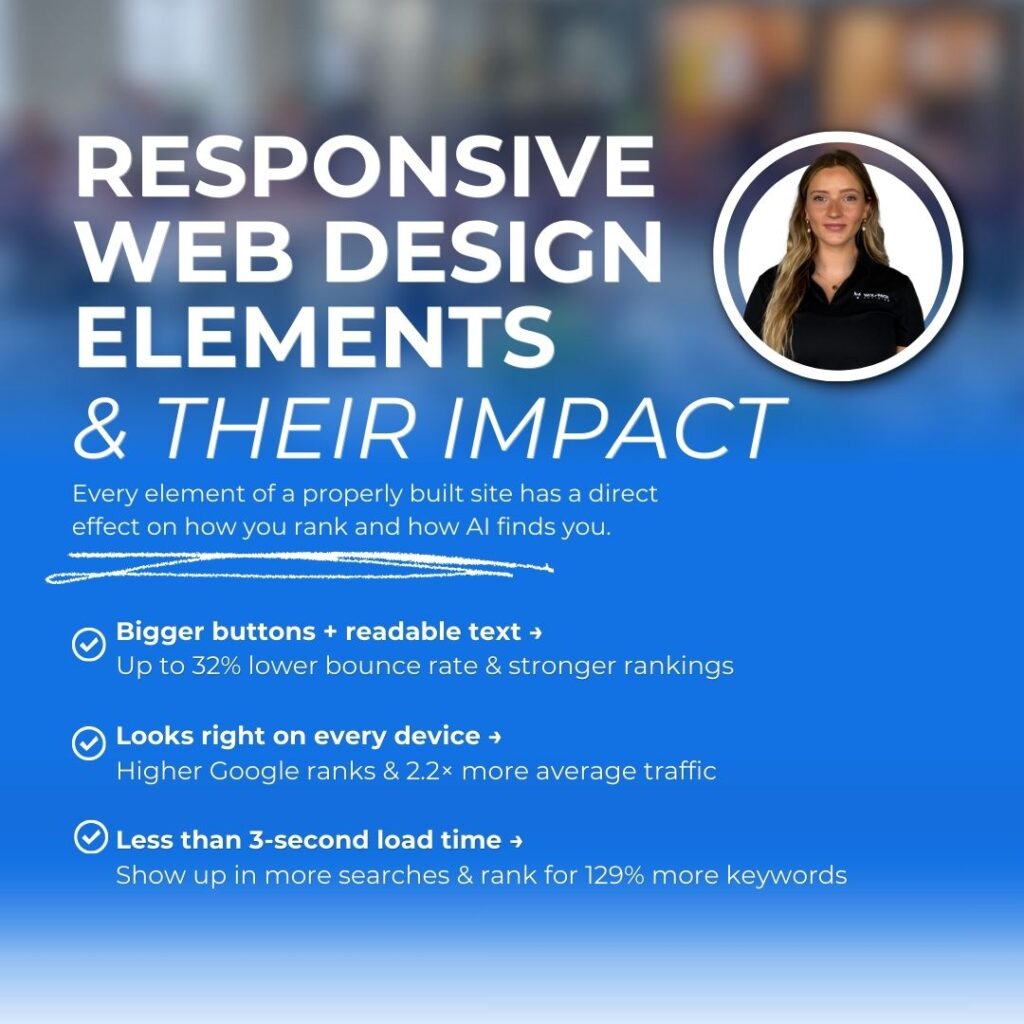
A responsive site built for performance tends to score well across all three. A poorly built or non-responsive site tends to fail at least one, and those failures directly affect your search rankings.
User Experience and Engagement
Responsive design enhances the overall user experience, and that improved user experience shows up directly in your SEO results. When a site loads cleanly and reads well on mobile devices, users stay longer, engage more, and leave less quickly.
High exit rates and low time on page signal to search engines that your content did not give the user what they were looking for. Over time, those behavioral signals pull your search rankings down. A better mobile experience creates better engagement data that feeds back into rankings.
Eliminating Duplicate Content
Maintaining separate versions of your site at different web addresses creates duplicate content issues that water down your authority across multiple pages.
A single responsive site keeps everything under one web address, which is better for both search engine crawling and your site’s authority over time.
A Stronger Foundation for SEO Strategy
Responsive web design is not just a technical checkbox. It is a foundational piece of any serious search engine optimization strategy. Sites that meet Google’s mobile performance standards start from a stronger position.
That foundation lets your content, links, and authority build over time instead of fighting against technical problems.
Responsive Design and AEO: What Most Businesses Miss
Search behavior is changing. A growing share of searches now get answered directly by AI tools without the user ever clicking through to a website.
Google AI Overviews, ChatGPT, Perplexity, voice search. These tools look for content that they can quickly pull a clean, trustworthy answer.
That is what AEO (Answer Engine Optimization) addresses.
AEO means structuring your content so AI-powered search tools can find it, read it, and use it to answer a user’s question directly.
And responsive web design is more connected to AEO performance than most people realize.
AI search tools prioritize sources that are fast, cleanly structured, and easy to read. A site that loads slowly or displays poorly on mobile devices creates friction for those tools.
A responsive, well-structured site removes that friction and makes it easier for AI systems to find your content, understand it, and credit it in a generated answer.
The things that support AEO visibility line up directly with what good responsive web design requires:
- Fast page load speed so AI tools do not skip over your content
- Clean heading structure using H1, H2, and H3 labels consistently so AI tools understand what each section is about
- Schema markup (a type of behind-the-scenes code that labels your content) so search engines know exactly who you are, what you do, and where you serve
- Direct, answer-first content near the top of each page so AI can pull a usable response
- A single stable web address so your authority builds on one version of each page
Responsive design is the foundation on which all of that sits. You can execute your AEO strategy well and still underperform in AI-generated results if the underlying site is slow or hard to read.
Accessibility and User Satisfaction
One area that often gets overlooked in the search engine optimization conversation is accessibility. Responsive web design makes websites easier for everyone to use, including people with disabilities.
That matters for SEO because Google factors user experience into rankings, and it matters for your business because an inaccessible site is turning away potential customers before they ever contact you.
A few practical things that connect responsive web design to accessibility and user satisfaction:
- Clickable elements should be at least 44 by 44 pixels so they are easy to tap on a touchscreen
- A minimum font size of 16px improves readability for mobile users across all screen sizes
- Responsive design supports tools like screen readers that help visually impaired users navigate a site
- Following WCAG (Web Content Accessibility Guidelines) provides scalable fonts, flexible layouts, and simplified navigation that work for all users
- Spacing buttons and links properly prevents accidental taps and creates a smoother experience on mobile devices
Responsive design improves overall user satisfaction by creating a consistent experience across devices that works for everyone. That improved user satisfaction is a measurable input into your SEO performance and your conversion rates.
What Our Client Data Shows
We analyzed performance data across several WolfPack-built sites and several outside-built sites, all active WolfPack SEO clients. The distinction matters here.
The WolfPack-built sites share a consistent technical foundation: responsive web design built for mobile-first indexing, compressed images, clean web address structures, and schema markup in place from launch.
The outside-built sites came to us without most of those elements, meaning SEO efforts often started on a weaker technical base.
The performance gap was significant.
WolfPack-built responsive sites averaged 2,313 monthly organic visits compared to 1,073 for outside-built sites. That is 2.2x more web traffic.
They also ranked for 129% more organic search terms (3,325 vs. 1,455) and carried a higher average authority score (18.6 vs. 17.4).
What Stood Out Most
Even newer or slower-performing WolfPack-built responsive sites held 400 to 2,200 monthly organic visits. Several outside-built sites in the same analysis were stuck under 100 monthly visits despite receiving the same ongoing SEO services.
The technical foundation was setting a ceiling that content work alone could only help so much.
The growth stories make the point clearly. One WolfPack-built site reversed a steep traffic decline to reach 9,900 monthly visits, a +159% swing in six months. Another grew web traffic by 148% and keyword rankings by 31% in the same window.
That kind of momentum comes from SEO efforts compounding on a responsive, well-structured site that search engines already trust.
What a Non-Responsive Website Means Long-Term
Most business owners know their site could be better. What they do not always connect is how directly that translates to lost revenue.
- Lower search rankings and less organic traffic. Poor mobile performance and failing Core Web Vitals scores push you down in the search results. Every position you drop means fewer clicks.
- In local service categories, the top few organic positions capture the large majority of search traffic. Technical issues holding you back mean fewer inbound leads every single month.
- Leads that bounce before converting. Even when someone finds you, a hard-to-use mobile site means users are less likely to call or fill out a form. Traffic that does not convert is wasted spend on every other channel you are running.
- If the site fails potential customers on mobile devices, none of the upstream investment matters.
- Growing invisibility in AI results. If your site cannot be cleanly read by search engines and AI tools, you are being left out of AI Overviews and voice search answers.
- That is visibility your competitors may already be capturing, and it will only matter more as AI-driven search continues to grow.
- A compounding disadvantage over time. In-home services, local search competition is tight.
- If a competitor has a fast, mobile-friendly website with a strong responsive design and yours does not, they are going to outrank you, capture more AI-cited answers, and convert more of the traffic. That gap compounds in their favor over time.
How to Optimize a Responsive Website for SEO
Building a responsive site is step one. Keeping it optimized for search is an ongoing process. Here is what actually makes a difference:
- Compress images and use modern formats like WebP or AVIF to improve load speed without losing visual quality
- Use the viewport meta tag (a line of code that tells browsers how to scale your page) so content displays correctly across all screen sizes
- Add schema markup to help search engines and AI tools better understand your content
- Use lazy loading so images and videos that are not visible on screen yet do not slow down the initial page load
- Keep a single, clean web address structure with descriptive, easy-to-read page names separated by hyphens
- Keep heading structure consistent with one H1 (main title) per page and logical H2 and H3 (section and subsection) labels throughout
- Design for touch with buttons and links sized and spaced to prevent accidental taps on mobile devices
- Run regular audits using Google Search Console to check for broken links, crawl errors, and mobile usability issues
- Minify CSS and JavaScript files (reduce unnecessary code) to cut down on page load time across all devices
More than likely, a lot of these are unfamiliar, and that is completely normal.
A good starting point is asking an AI tool like ChatGPT or Gemini to walk you through (it or even conduct research or tasks for you).
Try prompting AI with something like: “My website is built on [platform]. Can you explain how to check my Core Web Vitals score and what to fix if it is low?” You will get a plain-English explanation tailored to your specific setup.
Common Questions About Responsive Website SEO
How does responsive design affect search rankings specifically?
Google uses mobile-first indexing, meaning your mobile experience determines your search engine ranking across all devices. Responsive websites that perform well on mobile get the full benefit of your SEO efforts.
A non-responsive site creates a ceiling that limits how far your search rankings can climb, regardless of your content quality.
How does a responsive website support AEO?
AI tools pull answers from sources they can load quickly and read cleanly. Responsive websites with fast load speed, clean structure, and proper schema markup remove the friction that causes search engines and AI tools to skip over your content.
That increases the likelihood that your pages get credited in AI Overviews and voice search results.
How do I know if my site has responsiveness issues?
Run your web address through Google’s PageSpeed Insights and check your Mobile score. You can also use Google’s mobile-friendly test for a quick read on usability.
A Mobile score below 70 is worth addressing, and any failing Core Web Vitals scores should be treated as a priority fix.
Do I need a full rebuild to fix responsiveness issues?
Not always. Some problems can be resolved with targeted updates to styling, image compression, or load speed improvements.
But if your site was built on an outdated platform or a template never designed for mobile performance, a rebuild is often the more cost-effective path. Patching a weak foundation has limits.
Browse real SEO and web design results produced by WolfPack:
The Bottom Line
Responsive web design is not a nice-to-have feature. It is the technical foundation that every other part of your digital marketing depends on.
The data from our own client base makes it clear. Responsive sites built with a mobile-first structure and proper technical optimization from the start generate more than twice the organic traffic, rank for significantly more search terms, and give SEO efforts something solid to build on.
If you are not sure where your site stands, that’s worth finding out.
WolfPack builds and optimizes websites for home service businesses that need to rank, convert, and stay competitive as search continues to evolve. Book a call with our team today.


